Thursday, June 30, 2011

Area estimation

Using Scilab, the area of an object with defined edges can be computed by first taking the pixel coordinates of the edges. Each successive pixel and a fixed point at the inside the contour defined by the edges, forms a triangle. Adding up the areas of these triangles would give you the area of the object. i is the area of one triangle with coordinates [(x1,y1),(x2,y2),(0,0)].


So for a circle with radius 0.7 units generated in Scilab, I used the function follow() to get the coordinates of the contour of the circle.


500x500 pixel image of circle with radius 0.7 unit
object contour

The area of the circle with radius 0.7 is 1.5393804 units while the computed area using the method described above is 1.525104. This puts the error to 0.9274121% from the real area, which probably arises from the discrete points defined by the pixel coordinates -- as opposed to a continuous contour. This should be expected since I'm solving for the area of a curved surface approximated by very small segments. The use of a higher resolution image may be able to minimize this error. For this image I used a 500x500 pixel image. For a 600x600 image, the %error is reduced to 0.7457806%.

If we use the same technique on a 500x500 pixel image of a square with side 1 unit, the area computed is 0.992016 unit, off by 0.7984% from the real area of 1 unit.

This technique can also be used to estimate the area of a place. Using a snapshot of The Pentagon from GoogleMaps, I estimated its area to be 41078 pixels or using the scaling found at the lower left of the snapshot, 140871.06 sq. meters. According to this article, the Pentagon building is built on 116,000 sq m of land, including a central courtyard that is 21,000 sq m. This comes to a total of 136,000 sq m, that brings the computed area to an error of 3.581659%. This could come from low resolution of snapshot, the method used or other GoogleMap-related errors. Not bad. :D

Snapshot of The Pentagon in GoogleMaps

The Pentagon isolated as one object, using Paint.


_______________________________________________________________________________
I'm giving myself 10 points for the activity. But I posted part of it late, so -3 for that. 

Tuesday, June 28, 2011

Image Types and Formats

Knowing the different image types and image file formats is very important in image processing. These determines the amount and quality of data that you can extract from an image.

Digitized images are basically numbers converted to the colors you see on screen. The smallest unit of an image, called the pixel (picture element), correspond to one or more numbers that tells the computer what colors to show. The image type determines how the pixels in an image are assigned their colors. The four basic types of images are  binary, grayscale, truecolor and indexed images.

Binary images contain only binary digits (bits): 0's and 1's, which translate to black or white per pixel. So that an image that is 256 x 256 pixels is only 256 x 256 bits = 65536 bits = 8192 bytes or 8KB (8 bits = 1 byte, 1 KB = 1024 bytes) when uncompressed. But let's leave compression for later.

binary image

Grayscale images are assigned a value from 0 to 255 per pixel which correspond to a shade of gray, where the extremes are black (0) and white (255). A pixel in a grayscale image is one byte.  

grayscale image
One pixel in a truecolor image is actually the combination of three colors: red, green, and blue. There are 256 (0-255) possible shades each of red, blue and green, that is overlaid to make the image of caps hanging on the wall (see below) look real. Three numbers assigned to one one pixel means 3 bytes per pixel. A truecolor image contains 3 matrices for the red, green, and blue shades.

truecolor image

The image below is something I made in Matlab before while playing around with the different colormaps available. Colormaps are shades of different colors with numbers assigned to each shade. Given any set of numbers (matrix type), the colors can be adjusted depending on the chosen colormap. This technique is very useful for visualizing data. Indexed images like this contain both the image data and colormap data.

Indexed image. Flujet (from Matlab samples) using colormap Hot.
Matlab colormaps
Other advanced image types include 3D images, high dynamic range images, multi or hyperspectral images and temporal images or videos.

Here's an example of a 3D image. The red, green, and blue shades are taken at different angles to produce an illusion of depth when viewed using special 3D glasses.


High dynamic range (HDR) images are very popular among photographers. HDR is actually a set of techniques combining a high resolution camera, lighting effects and image processing, that can produce crisp realistic images. HDR is great for images of scenery like the ones below.

HDR image

HDR image

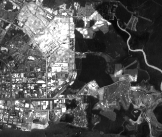
Multispectral images are usually used for scientific work like satellite imaging to get geological or atmospheric data. Multispectral images are images with data gathered for various bands of wavelengths. Shown below are  examples of images at the green band, red band, and near IR wavelength. Certain features of the land area taken are distinct only at certain wavelengths. Using images like these, the production of maps of bodies of water, forests, land use, and even rock or mineral types can be automated.

green band
red band
near IR band

Image File Formats
My digital camera can take images using 12.1 megapixels. That's (12.x 106) x 3 = 36.3 MB for one truecolor image! But of course, that is not the case. Humans are indeed witty. Someone bright thought of compressing the data stored in an image so that for one picture taken using my camera, I only get a 3 to 5 MB file based on the current setting.

UPPA org fair booth, June 27, 2011.
Clockwise from Tracy (*wink wink* everyone knows Tracy): Angel, Crizia, Josh, Ritz, Julia, Shiela, Aiko.
The little girl on the far left is Gil. She hates having her picture taken.
And in comes the different file formats. According to this list, there are over 500 different file formats you can use to save your image. The file size of the image depends on the format used. Different file formats compress the data stored in an image for easier distribution. For faster loading of images in a website, we'd want smaller files. Compression can either be lossless or lossy. Lossy compression cuts down on the file size by removing some data that may not be noticed at all. Of course, for work needing high resolution images like data gathering, compression must be lossless. Here's a table comparing five of the popular image file formats:

.tif or .tiff
Tagged Image File
(TIFF)
May use lossless compression depending on the graphics program used. TIFF files are usually saved with no compression at all.
.png
Portable Networks Graphics (PNG)
Uses lossless compression by using an algorithm (the same one used in .zip files) that looks for patterns in the images.
.jpg or .jpeg
Joint Photographic Experts Group (JPEG)
JPEG uses lossy compression by removing image data that could go unnoticed. This format is very popular for large image distribution especially online.
.bmp
Bitmap Image File
(BMP)
BMP is a format made by Microsoft for MS Paint that saves image files as is, pixel by pixel, without compression.
.gif
Graphics Interface Format (GIF)
GIF compresses an image file by making a colormap of only 256 colors (or less, depending on setting) from all available colors in an image. Thus, compression may be lossless or lossy depending on the original number of colors available.  
For a more in-depth and technical comparison, click here.

The term bitmap (not of BMP) actually refers to one of the two graphic types, the other one being vector, and is also better known as raster. Raster graphics contain dots of colors to form an image. It is easier to talk pixels as in raster graphics, one dot = one pixel. Vector graphics are quite uncommonly used compared to raster images. Instead of dots or pixels, it actually contains a set of instructions on how to make an image, which makes vector graphics resolution-independent. Vector graphics are usually found on programs like Microsoft Word (Shapes and Fonts) and CorelDraw.

In Scilab, we can determine the image type and other properties of an image by using the function imfinfo() from the siptoolbox. I listed the properties of some images I have below:


FileName: INDEXED.chimchar.gif
FileSize: 3607
Format: GIF
Width: 80
Height: 80
Depth: 8
StorageType: indexed
NumberOfColors: 256
ResolutionUnit: centimeter
XResolution: 72.000000
YResolution: 72.000000     


FileName: INDEXED.hot flujet.bmp
FileSize: 150626
Format: BMP
Width: 435
Height: 343
Depth: 8
StorageType: indexed
NumberOfColors: 256
ResolutionUnit: centimeter
XResolution: 0.000000
YResolution: 0.000000        


FileName: HDR.welcome.jpg
FileSize: 261447
Format: JPEG
Width: 900
Height: 509
Depth: 8
StorageType: truecolor
NumberOfColors: 0
ResolutionUnit: inch
XResolution: 300.000000
YResolution: 300.000000


FileName: dice.png
FileSize: 58618
Format: PNG
Width: 320
Height: 240
Depth: 8
StorageType: truecolor
NumberOfColors: 0
ResolutionUnit: centimeter
XResolution: 72.000000
YResolution: 72.000000


Knowing the image type and format can help one take advantage of the features of an image.


Note: All (but one) sample images used for this post are not mine. Unfortunately, my laptop crashed the other day, so I lost most of notes I have for this post, including the references. I will post the links to the images as soon as I find them again.


__________________________________________________________________________________
9 for effort. I didn't like this activity. Too much repetitive actions needed. -.-

Tuesday, June 21, 2011

Baby steps with Scilab

For me, the best way to learn a new programming language is by example. That, and figuring things out. Starting from an example code that creates a white circle on black background:


Try to figure out how each function work and what each line does. To make the guesswork easier, make friends with the language by learning how to ask for help. In Scilab, typing help _keyword_ or simply help opens the help window. Start by looking for the functions used in the example. I've already figured out what each line does and made comments. Comments are denoted by two slashes // and lasts for one line. Comments will not be interpreted and executed.


The sample program creates a circle and lets you view it using imshow. To be able to automatically save files, we can use the function imwrite. The following snippet let's you save the image produced from array A to a .jpg file on the path specified. You can choose what file format to use by changing the file extension, as long as it is supported by the function imwrite. See the imwrite help page for the list of supported formats.


The circle produced is centered and colored white in black background. As you may have figured out by now, the matrix A that produced this image is binary, with only 1's and 0's. The original matrix A, zeros(nx,ny) is black. The condition that all elements in A corresponding to the elements in r that are less than 0.7 be 1, makes the white circle. The image produced by imshow is grayscale with 0 being black and 1 being white.

circle.jpg

imwrite and imshow are special functions that came with the Scilab Image Processing (SIP) toolbox. Scilab toolboxes contain a set or sets of functions specialized for certain tasks like image processing. Functions in toolboxes will not work if it's toolbox is not loaded.

Now to play with the sample code. Try changing parts of the code and see what will happen. If you want to add a smaller black circle, add another condition:


annulus.jpg

If you want to make a different shape, look for the lines that makes the circle and modify. To make a square, I changed line 9 from the sample code to:


This produces a centered white square with side length defined by the variable side.

square.jpg

Modifying the first few line of the code this way:


I came up with:

roof.jpg

%pi is the constant pi or 3.1416... stored in Scilab.

The first three figures (circle, square, annulus) are actually images of apertures that can be used for simulating optical phenomena. The last one (the roof) is something we can use to make a figure that looks like a diffraction grating, by adding the condition:


grating.jpg
Now for a more challenging figure! A circular aperture with a Gaussian transparency. Try to visualize that first.
.
.
.
circular aperture with Gaussian transparency
That's just the same as the first circle, only that the center isn't purely white -- or that the elements of the matrix isn't just one or zero. The circle is shaded according to a 2-dimensional Gaussian function:


Well, it could be any function really. Or any aperture shape. You just have to set up the code for the aperture and the code for the shading, and combine the two. How to combine them to achieve the desired effect is the real question! And in comes the masking technique. Remember that the matrix that produces the image of the circular aperture contains only 1's and 0's, so that if we multiply this matrix to any matrix (of the same size, mind you) then we would retain the original values for those elements paired with 1 and nullify (to 0) those elements paired with 0.


And there you go! My first baby steps with Scilab shared with you. I hope you learned something, because I sure did. Don't hesitate to play around with the codes. Have fun figuring things out. :)


Ha! I'm giving myself a 10 for that Scilab lecture. XP


Equation for Gaussian function taken from: http://mathworld.wolfram.com/GaussianFunction.html

Thursday, June 16, 2011

Digital Scanning

You know how it would really be convenient to know the values of points in a plot that you want to recreate? When sometimes your professor or adviser asks you to recreate a plot or graph from a book or a research paper that somehow lacks the details like initial conditions, it would really be neat if you are able to know the values of points in a plot without asking the original author for them.


The first thing you can do is to have the plot scanned. Any plot would do, whether it's digitally made or hand-drawn. For this one, I used a hand-drawn plot back from 80s when computers weren't that popular yet. You have to make sure that the plot is scanned uniformly, with the paper lying totally flat on the scanbed. Any warps or distortion on the scanned plot will make things more complicated. Let's do the basics first.


The hand-drawn plot is now converted to a digital image, with points which we can measure in pixels. Microsoft Paint or any other image-editing software can give you the pixel values of any point on the graph. These points would of course correspond to a real physical value as indicated by the labels on the axes of the plot. The next problem is to figure out how the pixels are related to the real physical values. Once we've found this, we will be able to convert the pixel values of any point on the plot to its real physical value.


The digitally scanned plot is the similar to the hand-drawn plot, magnified or minified only by a factor. Assuming that warps in the scanning are negligible, then we can say that the real values are related to the pixel values linearly. Thus we can use the linear equation y = mx + b, x being the pixel value, y the real physical value, m the slope or ratio of pixel to real value, and b being the offset. Using points from the axis with known real physical values, m and b can be easily calculated. That's it! Using this conversion, one need only to pick a point, take note of the pixel values and convert.

Oh but wait. I accidentally picked a bit complicated plot. Notice that the x-axis of this plot is not uniformly scaled  (boxed in red). To resolve this, I had to cut the graph into four partitions, with the tick marks on the x-axis as the boundaries. I chose not to include the parts of the plot after x = 200 since there's no known upper boundary for it. It's not that hard really. It's as easy as what I described above, only that for each partition, there should be a different conversion for the horizontal pixel values.


The points I chose are in red. I picked points that include the values of the tick marks so I can easily check if my conversions are wrong. The real values of the points I picked were:

x
y
10.00
2.86
12.09
3.07
14.96
3.32
17.52
3.60
20.00
3.87
23.88
4.12
28.82
4.42
33.94
4.75
38.88
5.09
44.35
5.48
50.00
5.92
56.20
6.13
67.05
6.56
77.91
7.00
88.76
7.48
100.00
7.99
122.66
8.52
144.53
9.05
166.41
9.58
185.94
10.06
200.00
10.45
10.00
2.86
12.09
3.07
14.96
3.32
17.52
3.60
20.00
3.87
23.88
4.12
28.82
4.42
33.94
4.75
38.88
5.09
44.35
5.48
50.00
5.92
50.00
5.92
56.20
6.13
67.05
6.56
77.91
7.00
88.76
7.48
100.00
7.99
122.66
8.52
144.53
9.05
166.41
9.58
185.94
10.06
200.00
10.45


To better visualize how awesome that is, I plotted these in Excel for each partition, using the scanned image of the hand-drawn plot as the background.


As you can very well see, the recreated points in first and second partitions did not coincide that well with the hand-drawn plot. I guess this is somehow due to my lack of expertise then in pinpointing exact points in the bold lines of the original plot. The tick marks on 2 and 4 on the y-axis are also a bit off. Perhaps this is due to some small deviations in the intervals between tick marks. If I also did partitions on the y-axis, this error may be minimized.


That was kinda fun. :D


I'm giving myself a perfect score, yay! 10/10! :D
But I'm not really sure of 10, I left my rubric at school. Anyway, I'm still giving myself a 10 because I was able to do everything pretty well. The plots are almost the same, and I'm pleased about my explanation. There's a 10. Hope you understand everything. ;)


Hand-drawn figure taken from:


Y.Afek, G. Berlad, A. Dar, G. Eillam. The Collective Tube Model for High Energy Particle-Nucleus and Nucleus-Nucleus Collisions. Multiparticle Production on Nuclei At Very High Energies - Proceedings of the Topical Meeting in Trieste, 10-15 June 1976. International Atomic Energy Agency. Austria, July 1977.